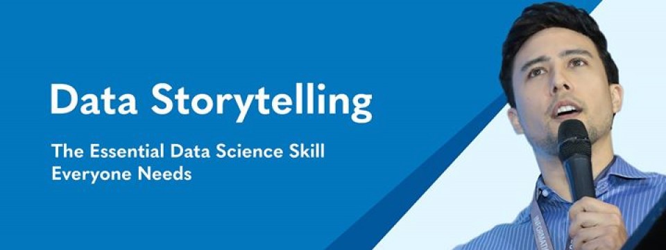
Learn how to tell amazing data driven stories in Excel and PowerPoint in this 2 day course delivered by Data Scientist and TEDx speaker, Isaac Reyes.
In this course you will learn:
* Why bar charts always outperform pie charts
* The 3 essential elements of a good data story
* The Gestalt principles of visual perception and how they can be used to create better graphs
* Edward Tufte's data-ink ratio
* Before and after data story 'make overs'
* How to leverage animation and interactivity to tell dynamic, engaging stories with data
Ready to join hundreds of professionals from the Philippines, USA, Australia and Singapore who have been trained by DataSeer? Enrol here http://dataseer.com/data-storytelling-business-visualization-course/
Course includes buffet hotel lunch and snacks.
---Instructor: Isaac Reyes - Data Scientist---
Isaac is an Australian data scientist, company founder and TEDx speaker who lives, breathes and dreams data.
He is currently the Head of Data Science at Altis and Principal at DataSeer. Altis is Australia's largest information management consulting firm and DataSeer is a leading data science training provider.
A passionate data science educator, Isaac has lectured in analytics and statistical theory at the Australian National University and the University of Canberra. In his previous roles, Isaac has worked as a Data Scientist at leading data consulting firms including Datapharm, Quantium and PricewaterhouseCoopers. He holds a Master of Statistics from the Australian National University and has over 3,000 hours of training experience. He has delivered his Data Storytelling course to leading companies in Silicon Valley, Australia, Singapore, New Zealand and the Philippines.
Read more


